 |
| Millennium Stage 20th Anniversary Celebration! On stage: Big Sam's Funky Nation |
[Full Disclosure: I am a current employee of the Kennedy Center. Any opinions expressed in this piece are my own personal views and do not represent that of the Center, its management, or its staff.]
To mark Millennium Stage's 20th anniversary this year, I decided to imagine: What would Millennium Stage have looked like if it had been built in 1971 along with the rest of the building?
Parameters of this theoretical: The stage has to live within the as-built version of the Kennedy Center. There are many different versions of the design, but let's go with the one that was settled upon. This project will draw inspiration from the original architecture of the Center's exterior, Grand Foyer, Hall of States/Nations, Eisenhower Theater, Opera House, Concert Hall, and other works by the Center's architect.
Let's start with examining the architect!
The Kennedy Center was designed by prominent 20th century architect Edward Durell Stone. Stone designed many iconic high-profile buildings, including the American Embassy in New Delhi, the General Motors Building & the Gallery of Modern Art in New York, and more.
Stone's style grew and evolved over the decades of his career. Stone was classically trained in the Beaux-Arts style, but took up the contemporary International and Modern styles of the day. Not enjoying the styles' rigid rules, he slowly developed his own aesthetic. This style was later known as New Formalism (also sometimes known as New Romanticism). New Formalism is a modern-age take on classical architecture rules and designs. Stone found he really liked it, and he used it on every building he created henceforth.
 |
| The John F. Kennedy Center for the Performing Arts |
Stone borrowed many elements from his previous projects and put them into the Kennedy Center. He did this with many of his projects. The effect is that a lot of his architecture looks the same. "While the increasingly formal, classical elegance of his architecture appealed to the general public, architecture critics progressively considered his work routinized--a prepackaged aesthetic that had become ordinary and uninspired," writes Mary Anne Hunting, author of Edward Durell Stone, Modernism's Populist Architect. "What is more, their critical opinion of his work as stale began to overshadow his former success."
While his replicating might have hurt his successes, it does make his style incredibly easy for others to replicate. Let's look at what pops up in an Edward Durell Stone building/theater:
Patterns, Lines, & Geometry:
Edward Durell Stone decorated in shapes. The Kennedy Center is covered in lines, squares, circles, and hexagons. From the shapes he chose, he created patterns. Shapes would repeat themselves by getting bigger and surrounding the initial shape. Then that whole grouping was repeated further down the wall or ceiling. There is constant repetition throughout the building in many different forms.
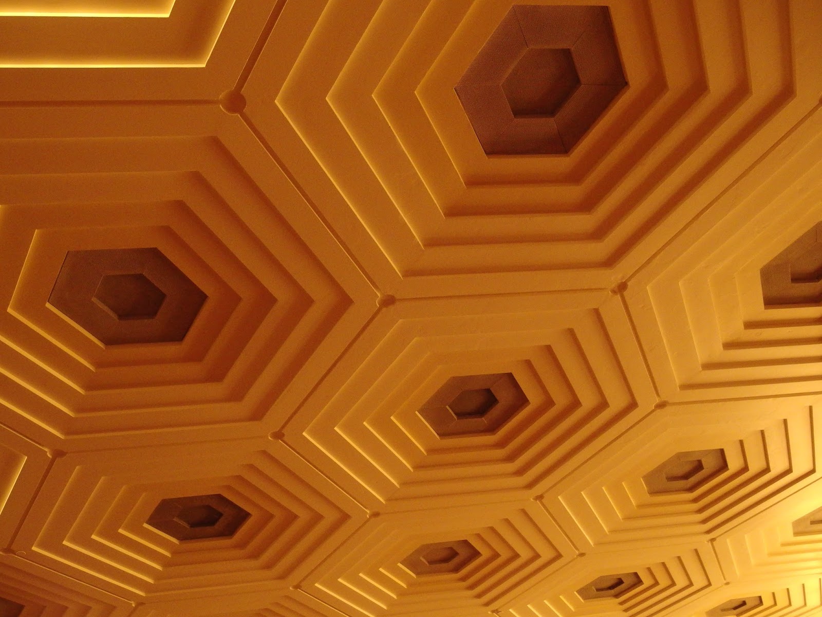 |
| Concert Hall Ceiling (note the circles in the corners, those spots used to house golden spheres) |
 |
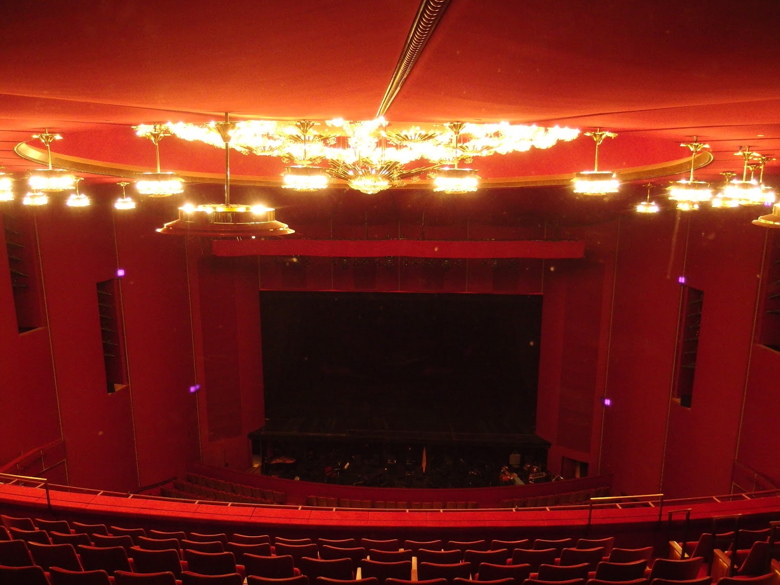
| Stress the vertical (The chandeliers were originally hung lower until Millennium Stage was built) |
Nothing interrupts a vertical line. Vertical lines are all straight. Horizontal lines are mostly straight, but some are allowed to curve. The curves are all very drawn out, very romantic.
 |
| 2nd Tier Balcony of the Opera House |
Patterns can also be created through shadows. Stone had to have loved shadows. He was always adding negative space in walls and ceilings so light could shine through and play with his patterns. Much like mobiles created by Alexander Calder (a friend of Stone's (this guy was connected)), Stone created a moving art piece by manipulating the shadows coming into the building. You could spend all day watching how shadows move across the Grand Foyer.
 |
| The Grand Foyer has beautiful shadows |
 |
| Shadows -- in action! From Top Notch 2016 (Tan carpet only present for breakdancing) |
There are different patterns and feels expressed throughout the building, but they stay separate. When you are in the Grand Foyer, you are in the Grand Foyer pattern's environment. Once you step into the Opera House, you are now in that pattern's domain.
Naturalism:
Edward Durell Stone and Frank Lloyd Wright were good friends and loved each other's work (Like I said earlier, this guy was connected). They both desired different choices to the mainstream's Modernism at the time. Stone was very much inspired by Wright's style and had a whole period of his career where he designed buildings very similar to Wright's. One thing he brought out of that period was a love for nature.
While Wright designed buildings that harmonized/interacted with nature and the landscape, I find Stone ultimately designed buildings that showcased nature. He planned huge windows that looked out onto gorgeous landscapes. Inside, there were interior garden spaces which, along with planters, could feature decorative pools and fountains. You are in Stone's meticulously-designed and controlled environment.
 |
| Kennedy Center River Terrace |
Besides living plants, Stone also incorporated natural materials into his decor. He used marble on the walls and floors (when the budget allowed). Wood paneling was also common.
The Kennedy Center fits well in Stone's naturalism. Short trees and shrubs surrounded the Center on three sides in individual planters. Huge windows look out onto the Potomac River and Theodore Roosevelt Island, framed by willow trees on the River Terrace. Potted trees originally lined the Grand Foyer. Marble and wooden parquet floors took over where red carpet stopped. The original Eisenhower Theater was almost entirely composed of dark wooden paneling.
 |
| Winter vista from the Eisenhower Balcony Level |
Horror Vacui/Simplicity:
Horror Vacui is a term I just learned, it means a "fear of empty space." This is a feeling I feel a lot of times. I don't think Stone had this fear. He liked the clutter-less look. Many of his designs, even going back to when he was in school, are very austere.
His designs are not completely blank. He does use ornamentation regularly in his work. By leaving everything else blank, it directs your eye to that ornamentation. It heightens its importance. You wouldn't have noticed that particular detail as much if there had been paintings and crown molding and et cetera, et cetera, et cetera.
(Something to learn from Stone: If you are going for the spartan look and make it hard for people to tell the difference between one area and another, you should probably integrate signage into your design. It's important to remember that while you may view your architecture as standalone "art" (which it rightfully is), you are also creating a living building. The Center in particular has hundreds of performance and non-performance events a year, and it is visited by thousands of guests every day. Signage is inevitable. People will add it later anyway, and their signage will never fit in as well as you would have liked. Control your design's future by taking preventative steps where and when you can.)
Color:
Stone loved theatricality. He regularly used in all of his works the colors of drama and theater: white, gold, and red. "[Stone] insisted on certain traditional symbols of luxury characteristic of theater design or other opulent spaces, including metallic (especially gold) surfaces, white marble, dark wood, and royal-red textiles-- all very seductive and sumptuous," writes Hunting. It's no wonder when he designed the National Cultural Center, the building is composed of white marble walls, gold columns, dark wood paneling, and red carpet.
Monumentality/Size Matters:
Mainstream Modernism during Stone's time had a problem with monumental architecture. Through taking inspiration from monumental architecture of the past, Stone was able to bring monumental into his work. "This 'new public architecture'" writes Hunting, "...not only demonstrated that monumentality no longer had to be articulated in a specific format but that together with Modernism it could express the American conscience while symbolizing the nation's heritage."
Modernists believe that form should follow function on buildings. A form with monumentality was not necessary for the function of most buildings. Of course, as the Kennedy Center's function is to be a monument to the late President John F. Kennedy, it could be argued the building does adhere to form-follows-function Modernism by expressing monumentality.
Let's segue over from monumentality to monumental, as in size. When the project asked for it, Stone knew how to economize size (he was great at organizing a building to make it all fit together). But when he had the means, he made his buildings big. The Kennedy Center is on its own scale. The Grand Foyer is one of the largest rooms ever created. Ceilings loom over guests' heads. The building is over two football field lengths long! Nothing describes it better than monumental.
Built-In:
Don't you hate when doors and unneeded stagelights get in the way of your design? When you're Edward Durell Stone, you say 'Why Should It?' Often, there are hidden compartments or doors that blend into the design. You can never mess up a vertical line in a Stone building.
This also ties in with an effort to keep the behind-the-scenes behind the scenes. The public does not need to see the inner workings of the theater. If it needs to be accessed, it can be opened. But once it's done and is closed, the door disappears like it was never there.
Proscenium Arch (Or Lack Thereof):
For those that do not know, the proscenium arch is the border (picture frame) around the stage. It's a physical marker of the invisible 4th wall. Think of it as a portal between the world of the audience and the world happening on stage.
In classic turn-of-the-century theaters, there is much ornamentation and architectural pizzazz around these proscenium arches. So what does Stone do? He ignores it. His walls simply end where the proscenium starts.
Floating:
Stone likes to make you think his buildings can float. The walls on his New Dehli Embassy and the Stuart Building in Pasadena, CA seem to not touch the ground. At the Kennedy Center, Stone takes it up a notch. When viewed from across the Potomac River, the whole building floats, like it is an alien spaceship hovering above the land, imparting the performing arts to the barren performing arts D.C. landscape of the 1970's.
Of course, the floating is an optical illusion. At the Center, the effect is practical. Rock Creek Parkway runs between the Kennedy Center and the Potomac River. A couple floors above, the Center extends over the Parkway so to allow more space on the building's River Terrace.
Horror Vacui is a term I just learned, it means a "fear of empty space." This is a feeling I feel a lot of times. I don't think Stone had this fear. He liked the clutter-less look. Many of his designs, even going back to when he was in school, are very austere.
His designs are not completely blank. He does use ornamentation regularly in his work. By leaving everything else blank, it directs your eye to that ornamentation. It heightens its importance. You wouldn't have noticed that particular detail as much if there had been paintings and crown molding and et cetera, et cetera, et cetera.
 |
| Lighting fixture in a stairwell. Don't beware the bare. |
(Something to learn from Stone: If you are going for the spartan look and make it hard for people to tell the difference between one area and another, you should probably integrate signage into your design. It's important to remember that while you may view your architecture as standalone "art" (which it rightfully is), you are also creating a living building. The Center in particular has hundreds of performance and non-performance events a year, and it is visited by thousands of guests every day. Signage is inevitable. People will add it later anyway, and their signage will never fit in as well as you would have liked. Control your design's future by taking preventative steps where and when you can.)
Color:
Stone loved theatricality. He regularly used in all of his works the colors of drama and theater: white, gold, and red. "[Stone] insisted on certain traditional symbols of luxury characteristic of theater design or other opulent spaces, including metallic (especially gold) surfaces, white marble, dark wood, and royal-red textiles-- all very seductive and sumptuous," writes Hunting. It's no wonder when he designed the National Cultural Center, the building is composed of white marble walls, gold columns, dark wood paneling, and red carpet.
 |
| Eisenhower Theater Box Tier level |
Monumentality/Size Matters:
Mainstream Modernism during Stone's time had a problem with monumental architecture. Through taking inspiration from monumental architecture of the past, Stone was able to bring monumental into his work. "This 'new public architecture'" writes Hunting, "...not only demonstrated that monumentality no longer had to be articulated in a specific format but that together with Modernism it could express the American conscience while symbolizing the nation's heritage."
 |
| Kennedy Center exterior |
Let's segue over from monumentality to monumental, as in size. When the project asked for it, Stone knew how to economize size (he was great at organizing a building to make it all fit together). But when he had the means, he made his buildings big. The Kennedy Center is on its own scale. The Grand Foyer is one of the largest rooms ever created. Ceilings loom over guests' heads. The building is over two football field lengths long! Nothing describes it better than monumental.
 |
| A tall, tall door into the Bird Room |
Built-In:
Don't you hate when doors and unneeded stagelights get in the way of your design? When you're Edward Durell Stone, you say 'Why Should It?' Often, there are hidden compartments or doors that blend into the design. You can never mess up a vertical line in a Stone building.
This also ties in with an effort to keep the behind-the-scenes behind the scenes. The public does not need to see the inner workings of the theater. If it needs to be accessed, it can be opened. But once it's done and is closed, the door disappears like it was never there.
 |
| Nothing gets in the way of an Edward Durell Stone design. Not even an exit door. |
Proscenium Arch (Or Lack Thereof):
For those that do not know, the proscenium arch is the border (picture frame) around the stage. It's a physical marker of the invisible 4th wall. Think of it as a portal between the world of the audience and the world happening on stage.
In classic turn-of-the-century theaters, there is much ornamentation and architectural pizzazz around these proscenium arches. So what does Stone do? He ignores it. His walls simply end where the proscenium starts.
 |
| Kennedy Center Opera House (The red covered gangway was temporary) |
Floating:
Stone likes to make you think his buildings can float. The walls on his New Dehli Embassy and the Stuart Building in Pasadena, CA seem to not touch the ground. At the Kennedy Center, Stone takes it up a notch. When viewed from across the Potomac River, the whole building floats, like it is an alien spaceship hovering above the land, imparting the performing arts to the barren performing arts D.C. landscape of the 1970's.
 |
| The Kennedy Center floats! |
Of course, the floating is an optical illusion. At the Center, the effect is practical. Rock Creek Parkway runs between the Kennedy Center and the Potomac River. A couple floors above, the Center extends over the Parkway so to allow more space on the building's River Terrace.
 |
| Rock Creek Parkway going under the Kennedy Center's River Terrace |
Grillwork/Meshwork:
Both architectural signatures of Stone's, grillwork and meshwork are missing from the Kennedy Center. They both have a similar effect when used. They diffuse light, create a repetitive pattern, and produce captivating moving shadows.
Grillwork was prominently featured in Stone's New Delhi American Embassy to much success. Then it was used in his U.S. Pavilion at the 1958 Brussels World's Fair. Then in a myriad of other Stone buildings. Grillwork became known as a EDS staple. By the time the Kennedy Center was designed, I believe either Stone realized this or the National Cultural Center Advisory Committee did not want their building to be a replication of many others.
Although meshwork is not used here, the shapes Stone created with it are echoed in the Kennedy Center twice. Stone created two kinds of ceilings with mesh, tent and wavy. Tent-style meshwork imitates the inside of a big-top circus tent. An example of this meshwork can be seen in the Beckman Auditorium at Cal Tech in Pasadena, CA. In the Opera House, the walls and ceiling are solid red fabric that billow inwards from their seams, much like a circus tent.
 |
| Opera House and its "Under the Big Top" feel |
 |
| Eisenhower ceiling. This was originally painted red |
Overhanging Eaves:
Eaves hang multiple yards over the main building block on Stone buildings. Sometimes, there are cut-outs in the eaves, creating interesting shadow patterns throughout the day. Until the final design, the Kennedy Center was going to have these in its eaves as well.
 |
| Cut-outs in overhanging eaves at National Geographic Building in Washington, D.C. by Edward Durell Stone |
Golden Balls:
In every theater in the Kennedy Center, there are golden spheres in the walls and on the ceilings. They are everywhere! This is the subtle ornamentation Stone added to his designs. The Hall of Nations and States also both feature bronze sphere lights.
 |
| Balls in the Opera House |
As the Kennedy Center has been renovated, these balls have become endangered species. Spheres used to live in every hexagon corner on the Concert Hall ceiling. Now they only dot the edges and surround the chandelier bases. The Eisenhower Theater's balls were completely eradicated. So far, the Opera House and the Concert Hall's walls have been immune to any major loss.
 |
| Some of the remaining balls on the Concert Hall Ceiling |
There are probably other obvious things Edward Durell Stone did that I am forgetting to write about here, but this has been a good starting place.
----------------------------------------------------------------------------
The Ideas
So, with all that in mind, it's time to create!
All of the ideas I dreamed up are proscenium stages. With the space afforded, there isn't a better theater arrangement without starting to impact seating and the lobby space for the adjoining venue. While the imagined setup mostly follows the current setup, there are some changes, which I'll talk about further down in the page.
[I have heard a couple numbers bounced around how long everything is. For simplicity's sake in my designs, I am making the Grand Foyer 40' wide and 60' tall.]
What would an Edward Durell Stone Millennium Stage look like?
Idea A: Continuing Grand Foyer
The main idea here is to harmonize with the Grand Foyer's style. The main pattern in the Grand Foyer is upside-down U's. So that's what I went with!:
 |
| Idea A |
These would imitate the white of the tiers in every lobby, as well as the spacing between each line.
 |
| Opera House Lobby Tiers facing the Grand Foyer |
After I had come up with Idea A, I kept getting bothered by the fact that this design didn't have any golden balls. Every other venue had some repeating golden sphere pattern, so these stages should as well! I digitally tested adding spheres to Idea A. That didn't work out well. There was too much going on, and it was cluttering the main design.
 |
Test 1: Circles beween each main pattern.
Test 2: Circles in-between the layers of the main pattern itself.
|
I then came up with a new proscenium design with a repeating ball pattern. This look was inspired by wall mesh in Edward Durell Stone's custom-designed New York apartment.
I used the Opera House's half-spheres as a model for the Millennium Stage ones. Their diameter is 2 1/2". I decided to add 1/2" of space between each sphere so they weren't completely crowded in. This amounted to 160 balls across by 114 balls tall, or 9,024 balls total covering the whole facade. (If there was 0" of space between each ball, I could fit 192 balls across).
 |
| Idea B (I had no desire to draw over 9,000 circles, so this was made in Paint with the spray can tool.) |
Based off the current stage's light columns, I came up with a future iteration for this facade. When LED technology became readily available, the golden balls would be traded out for translucent ones. Each ball would have an LED that could be individually programmed. It is safe to say this would be very visually overwhelming, but I dare you to find a lighting designer who wouldn't have fun designing a show with those lights.
Idea C: A.J. Freestyles
Taking Edward Durell Stone patterns and such, this is what I would design:
 |
| Idea C* |
This idea is adding onto Idea A. I do like acknowledging the proscenium, even a little bit. I copied the Grand Foyer chandeliers' circular ceiling base design onto the top of the facade. A star is in the center because it is the symbol of Millennium Stage. The circles would be white, with the star either being gold, or white with the ability to light up from within.
OR, the star could be more abstract, à la sputnik star style. These would be made by Lobmeyr, creators of the Opera House (and Lincoln Center's Met Opera) chandeliers. They would mass together at the center and project outwards. Lights could be embedded into the whole top of the facade. They would be programmed to twinkle and simulate a "Big Bang" explosion at the start every Millennium Stage show.
*When I finally drew this, I realized how much this looks like Captain America's shield. Whoops!
D: Alternate Reality: Grillwork
If Stone had not overused his grill concept, I feel like he could have used it for the Millennium Stage design. My question would be what would be behind the grillwork? Stone usually had glass behind it. For a theater, you want to be able to control light and sightlines, so I feel the grillwork in this instance would be backed by a black wall or curtain. Lights could also be placed in-between the grillwork and its backing for some interesting lighting looks.
Structural Ideas:
Here is a basic overhead drawing of the current Millennium Stage by the Eisenhower Theater:


Millennium Stage's backstage currently dead-ends. The only ways onto the stage is via stairs or a ramp on the side of the stage. In older iterations of the stage before accessibility ramp additions, there was a wheelchair lift hidden behind side curtains. This 1971 stage would not have stairs, a lift, or a ramp, but it would not dead-end either! There would be a door added that would connect the Millennium Stage backstage with the adjoining venue's space. Currently, that would be into a bathroom. I haven't thought theoretically beyond that door, only that there would be a lot of space reorganization happening.
Like Stone's other theaters, the 1971 Millennium Stage would have hidden doors and hatches to get to all the interior mechanisms. This would also include chair storage space. At the current stage, when the chairs aren't set for a performance, they are stored on chair racks under each stage. They are hidden by a simple curtain. For this early stage, the facades would continue down and cover the openings. The designed facade would either be attached to the racks themselves, or lift up and away for chair rack access.
On the 1998 stage, to be able to light the front of the stage, the first electric lighting row had to be placed in front of the trompe l'oeil facade. The 2012's redesign had the proscenium tilt forward to hide this necessary feature. The 1971 stage would have lights built into the ceiling, much like the Concert Hall used to/still partially uses to light its stage.
Okay, this is where we get into higher discussions. On the current Millennium Stage, there is approximately two stories of empty air space above the stage. My idea is to pull the Grand Foyer's back wall right up to behind the proscenium arch for the stage. This way, all that empty space can be utilized productively!
 |
| Millennium Stage Air Space |
- Millennium Stage Rehearsal Room. This would have access to the stage via a spiral staircase located behind the stage's back curtain. This stage would definitely need be pushed forward a few feet to be able to fit the stairs along with everything else that is stored backstage.
- Fly system. Does a stage the size of Millennium Stage (24'x24') really need a fly system? That's a terrible attitude, let's add one anyway! The fly system could consist of every electric and curtain being able to move up and down, or there could be one line just for a main curtain. The curtain on each stage, of course, would be a gift from a foreign country.
- Lounge. One can never have too many lounge spaces at the Kennedy Center. Since they would be on the river side of the building, I would love for these lounges to have windows. That all depends if a suitable exterior window pattern could be created to allow such windows.
- Administrative offices. The Kennedy Center lacked/s sufficient office space. There's always a need for more of it.
- Tech space. I don't have a good idea as to how to integrate Millennium Stage's tech booth into the design. If 1971's Millennium Stage broadcasted each of its performances for television, I could see this space being used as the multimedia camera director location. Other than storage, that would be it.
- Organ. The Grand Foyer has unique acoustic qualities. Could you imagine one organ's melody filling that whole space? Or even playing organs on both sides at the same time?
- Another Mosby Hiding Space? Nah, he'd probably still like the unfinished Terrace Theater. Mosby is the legendary Kennedy Center cat. Look him up, he's a true story.
----------------------------------------------------------------------------
Final Thoughts
Edward Durell Stone's style is not one I would personally want to emulate. It's not my favorite style. I can appreciate pieces of it and certain views. This project definitely helped me appreciate his work more than before. His work is most certainly beautiful, but it can also be a hard pill to swallow.
I felt like the designs I came up with were alright. I think this came from that these weren't very creatively challenging to me. I was replicating the design in ways that I found obvious. I also felt they weren't busy enough, but that goes with my horror vacui tendency. It did fulfill what I wanted it to, which was harmonize with the Grand Foyer and Stone's architectural style.
Where the Center has renovated Stone's work: Stone's work hadn't aged well, but it still made bold statements. The new redesigned theaters and other spaces are fresh and pleasant to look at... but do they have character? Do they say anything? They fit in contemporary styles, but do they fit with the Kennedy Center? Is the Center to become a cacophony of different architectural narratives?
Did you like this project? Do you have your own ideas of what Millennium Stage could have looked like in 1971? Here's a template below, show me what you would design!

Sources:
Edward Durell Stone, Modernism's Populist Architect by Mary Anne Hunting (A great read, I owe much of this post to this book. Thank you, Ms. Hunting!)
John F. Kennedy Center for the Performing Arts by Brendan Gill
Modernist Architecture: A Funny Thing Happened on The Way To The Forum...
Quinn Evans Architects - Eisenhower Theater Renovation
Interview(s) with Garth Ross
Kennedy Center 1971 blueprints
Archival photos of the Center
Thanks To:
The whole Community Engagement team that runs Millennium Stage, it's the best team to work with!
Prof. Wynn/Muncy, for the little drafting skills I still remember from your class. Questions, qualms, queries, quose? Salutations!
Vaughan Bowen & Richard Podulka, for trying to decipher what my project was while still letting me look at old blueprints. Hope you understand it now!
Lauren Holland, for all your effort to get me permission to use archival photos, as well as your constant enthusiasm and support, you rock!